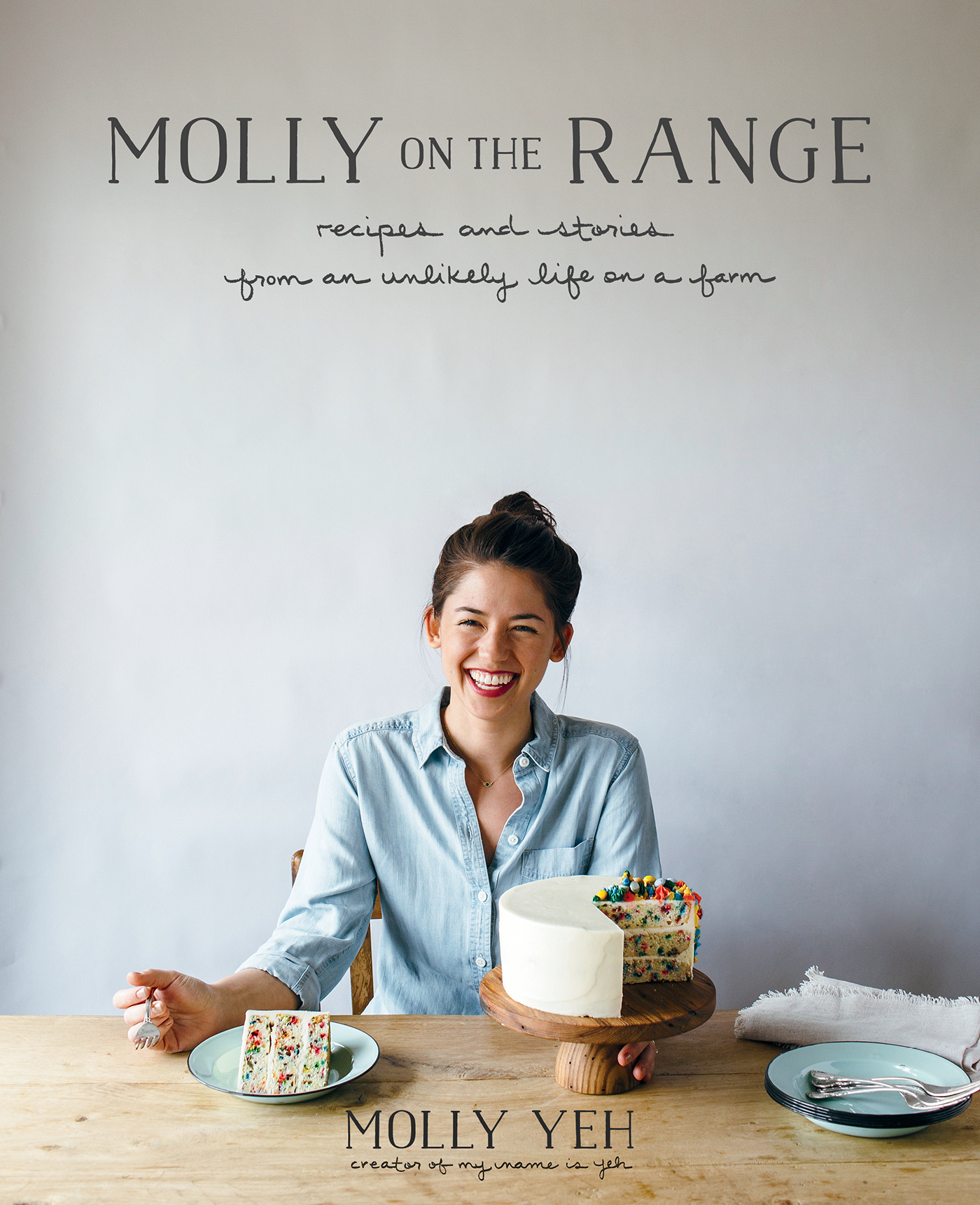
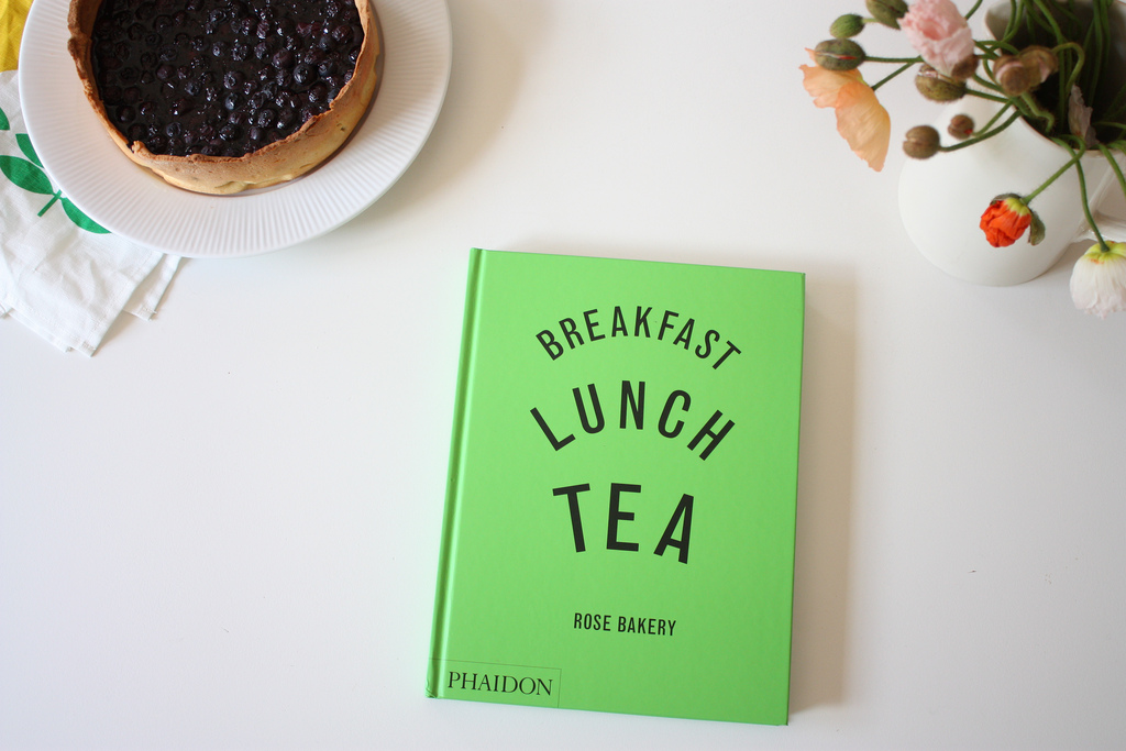
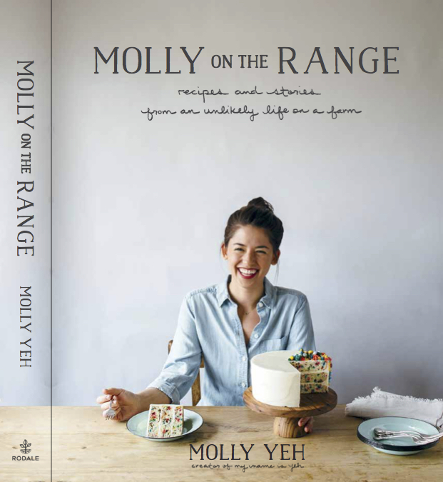
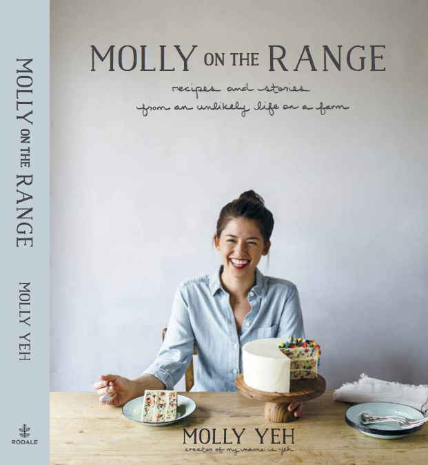
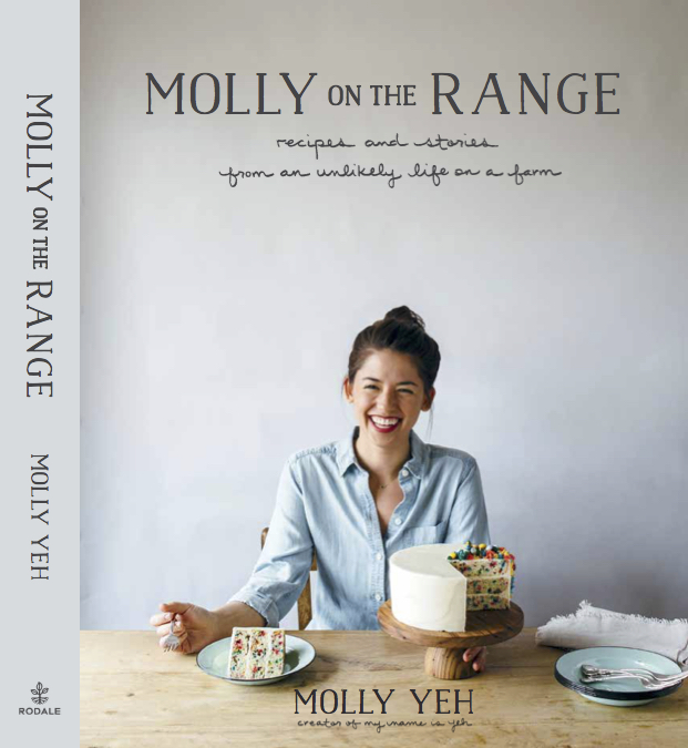
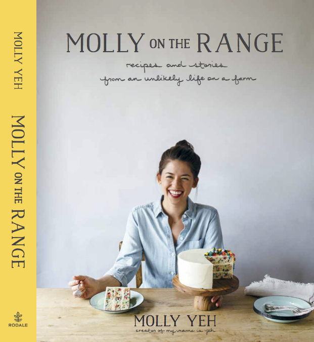
as a serial book-by-its-cover-judger, determining the cover of molly on the range was more difficult than picking all of the first day of school outfits from my past, combined. in the beginning, about two years ago while i was working on my proposal, i was really drawn to the idea of something painfully minimal, inspired by the covers of vintage church cookbooks and rose bakery's breakfast, lunch, and tea. when i was little i hoarded plain white t-shirts and absolutely refused to wear any clothing item with a brand label showing, so i suppose this was very on brand.
this is breakfast, lunch, and tea, the book that made me fall in love with food photography. source: little growing lights
"but, molly, how will people know this is a book about food??"
is a question that was raised by my publisher with the correct concerns that people might think it's a book about cow-wrangling or folk music or go-go dancing on top of a stove range.
"also, we want to put your face on the cover!"
well, hmmm. i wanted something timeless, and maybe something that you could even put on your coffee table as eye-popping room decor, and with my goal of becoming a blonde in 2016 already in the works, i did not consider a brunette 26-year-old kind-of-puffy-because-i-had-just-spent-a-year-recipe-testing-layer-cakes me to be a timeless image for the cover.
so i did some noodling around on the internet and decided that a very empty cover with a few homespun illustrations of cooking-related objects and chickens could be nice, timeless, and informative. with my publisher, we narrowed down our list of illustrators and started doing mockups. i loved folk-y, earthy illustrations that didn't feel at all trendy or too flashy. i wanted something that would be ok getting a little roughed up by soy sauce splatters and mustard stains. i was very excited about this.
but still, i was told, my face would be going on the cover!
oof da!! how would that work? how could a photo with an illustration look timeless and minimal and not like a third grade art project? we looked at various book covers that had done this recently, like the portlandia book. it worked for portlandia, but i definitely didn't see it working for molly on the range. i wanted to really try it though and see how it could work, because maybe there was something i was missing, so we even went so far as to hire an illustrator to do a draft, complete with super adorable chickens, loaves of challah, and an egg cracked open at the bottom of the cover. it was so fun but in the end it simply didn't mirror the content of the book.
i became more and more eager to figure out a cover that would welcome you. there was a lot of back and forth with my extremely patient publisher, and then i think it was at a barnes and noble in phoenix where i slowly began to see things from their perspective, re: my face on the cover. as eggboy, eggpop, and eggmom perused the american history, agricultural business, and novel sections, respectively, i placed myself in the cookbook section and judged covers. love and lemons made me want to go to the farmers' market and buy vegetables, home baked made me want to cream some butter with some sugar and eat a slice of cake and then learn to take pictures like yvette and oof. the books with smiling faces on the cover made me want to knock on those people's doors and sit in their kitchens while they not only cooked whatever they wanted to cook for me, but also talked to me about their stories and thoughts behind whatever they were cooking. and that's what this book is, it's narrative. one day i'd love to write a book about cakes or baking or one very specific group of foods, and for that, a cover with no face would make more sense i think. but molly on the range is you coming into my home and me telling you about my ex-boyfriends and the real eggboy story and farts, it's one side of a theoretical pen pal-ship, and the recipe selection has a little bit of everything.
so i said to my publisher, ok let's put me on the cover, but please can it be minimal.
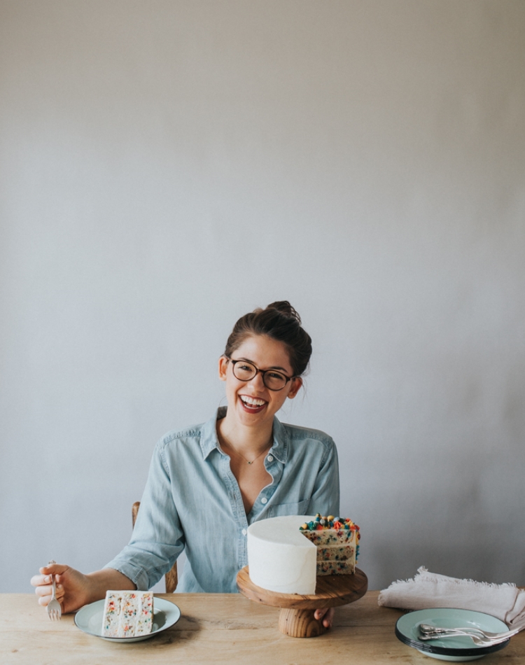
they obliged, but by this time the cover design was already way, way late, so we scrambled for inspiration. we loved the kinfolk table and this and that, and wanted to make sure it was as warm and happy as possible. i booked chantell to come that week, picked up a white background from a farm down the road (made new friends in the process!), and altogether tried to stop eating salt in an effort to look my best. luckily (!!!) the sprinkle cake that appears on the last page of the book was still in my freezer and ready to be a cover model.
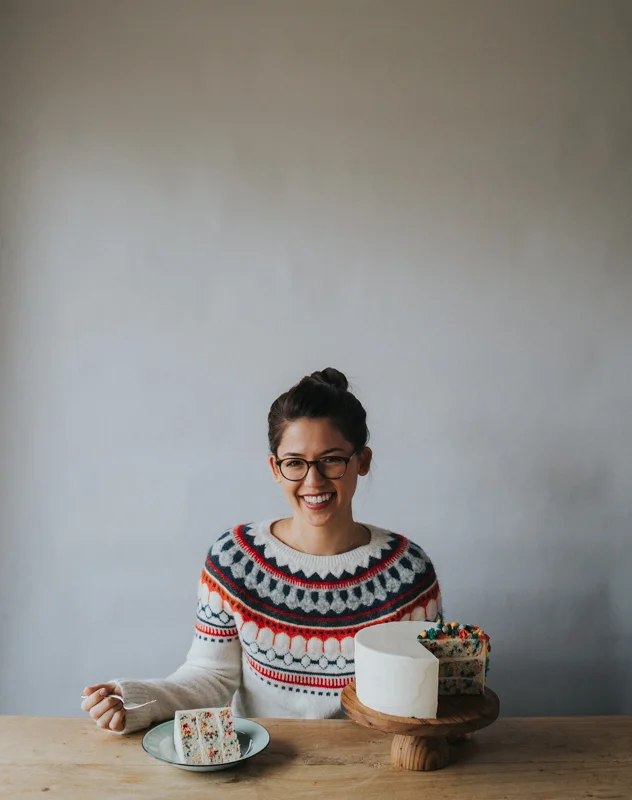
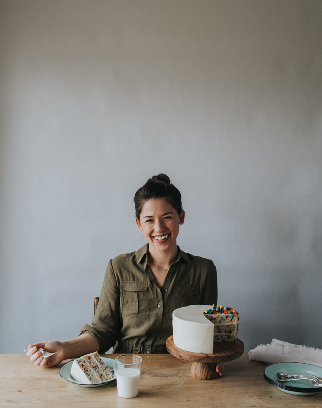
we had three wardrobe options:
the first one was eliminated almost immediately because it was too holiday-specific. and between the second and third one, it was collectively decided that the blue chambray shirt was more farm-y and timeless. bingo! so they airbrushed out my fly away hairs and away we went!
lisel jane ashlock's hand lettering for the subtitle gave it a kind of homespun quality that i love, and rae ann, my book designer, took to my obsessive requests for "a slightly more brownish grey/maybe more black than grey/maybe a little lighter but still really dark" font color with the patience of a saint.
and there it was, just like that!
it truly took a village and i am so happy with it! it was far from what i expected when i began writing the beast, but i feel that it represents me and the feeling that i want you to get from this book.
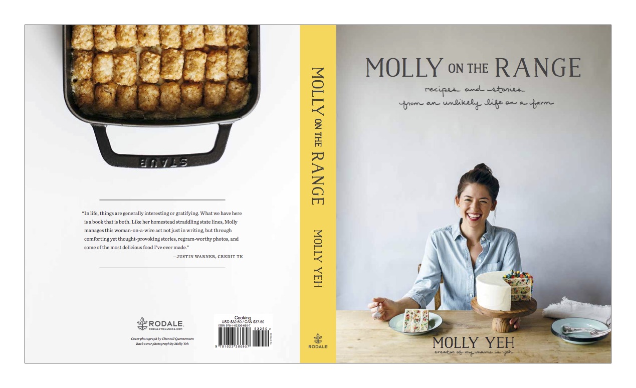
we weren’t finished though! we still had the spine and back cover to do, but it was a total walk in the park compared to the front cover process. it was almost like this, verbatim:
"molly, what color spine would you like?"
"yellow yellow!"
"ok! and how about the back cover?"
“can it be blank… like literally nothing except for maybe a blurb or a chicken?”
“nah, let’s put a photo on the cover. something that will tell people that it’s not exclusively a cake book.”
“oh. ok sure, what the heck!”
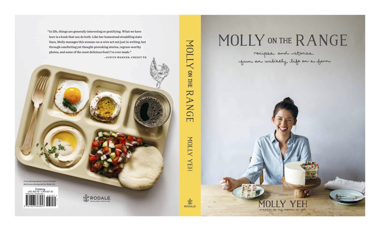
“how do you like these?”
“hotdish! perfect.”
“ok actually we like it but think that the tray would be more descriptive of the book’s contents.”
“umm hmmm errrrrrrm. ok”
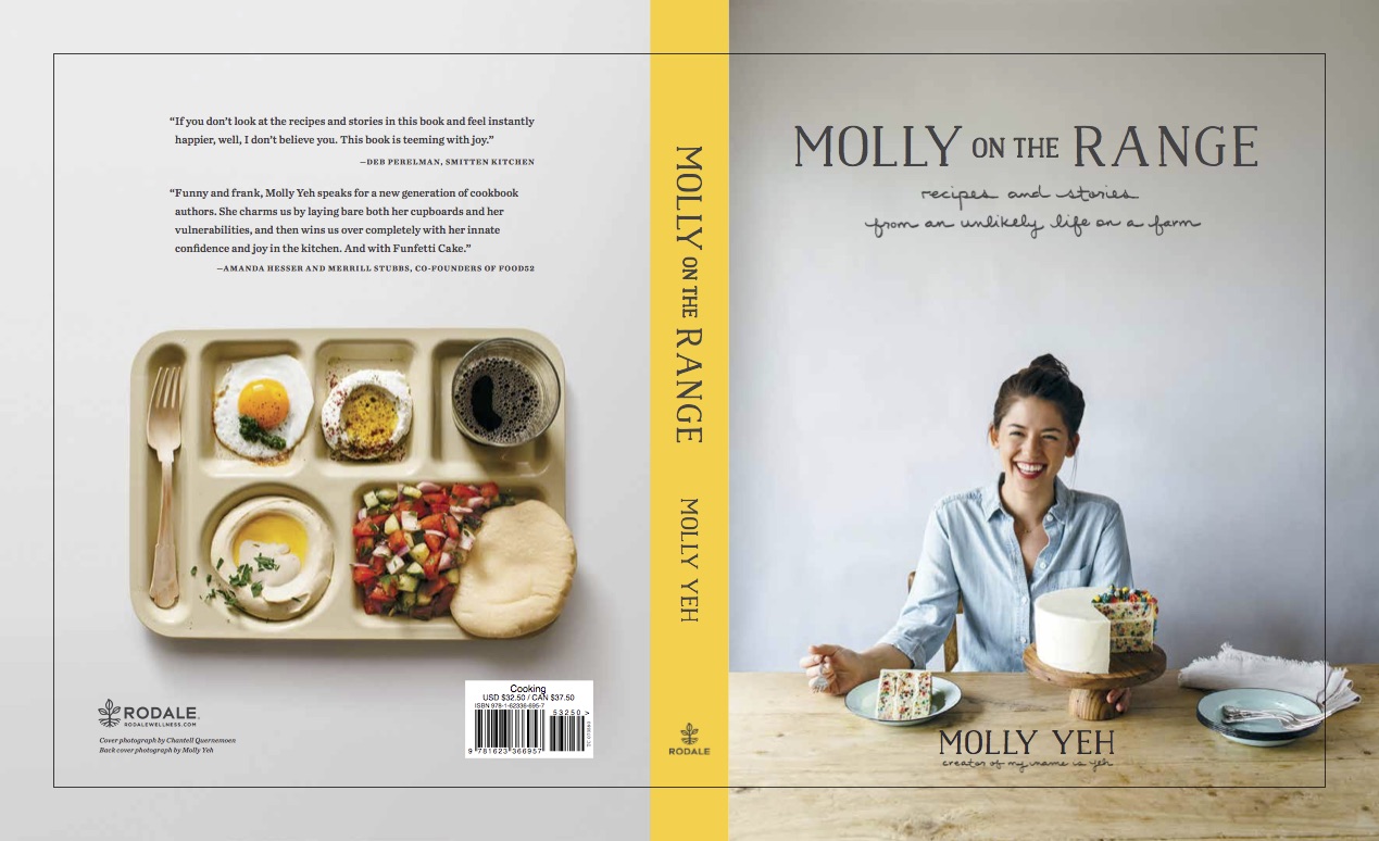
“this good?”
“yes, perfect.”
and just like that, molly on the range was dressed and ready for the first day of school and beyond. phew!! and i've gotten the sweetest feedback from you guys! so thank you for that. just one more month until she hits the shelves! eeeeeeee it’s almost here!!!!
-yeh!
(please preorder if you haven’t already!!)

